
NEKO CAT TREATS


-
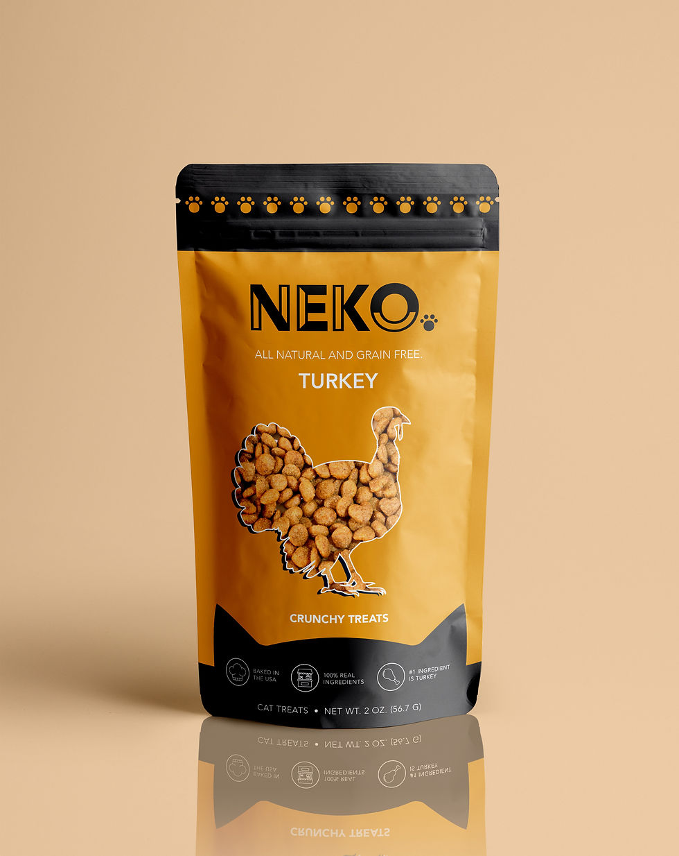
Vibrant color scheme representing each flavor: warm orange for chicken, soft pink for salmon, and golden yellow for turkey, creating immediate visual flavor associations.
-
Bold, modern sans-serif font for the brand name "NEKO," accented with playful paw prints to subtly hint at the cat-centric theme.
-
Clean, minimalist typography for flavor names and descriptions, ensuring readability and balancing the bold logo.
-
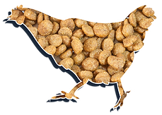
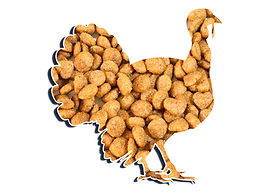
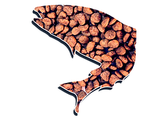
Animal silhouettes (chicken, salmon, or turkey) filled with actual treats, visually reinforcing the product's natural ingredients.
-
Small, uniform icons at the bottom highlight key selling points like "baked in the USA" and "100% real ingredients," making key info easily accessible.
-
Paw print border along the top adds a whimsical, charming touch without overpowering the design.
-
Perfect blend of functionality and fun, appealing to both cat owners and their furry companions with a premium, visually engaging product design.
-
Distinct flavor representation through color ensures quick visual recognition and adds a playful element to the packaging.
-
Well-thought-out design balance between fun, charm, and a premium, high-quality aesthetic to stand out on shelves.
-
Attention to detail in every aspect, from the color choices to the functional design elements, ensuring a cohesive and visually appealing product.

